Burning Man Project
Reimagining a global cultural platform.
Client Overview
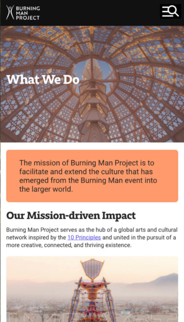
Burning Man Project serves as the hub of a global arts and cultural network united in the pursuit of a more creative, connected, and thriving existence. The mission of Burning Man Project is to facilitate and extend the culture that has emerged from the Burning Man event into the larger world.
Services provided
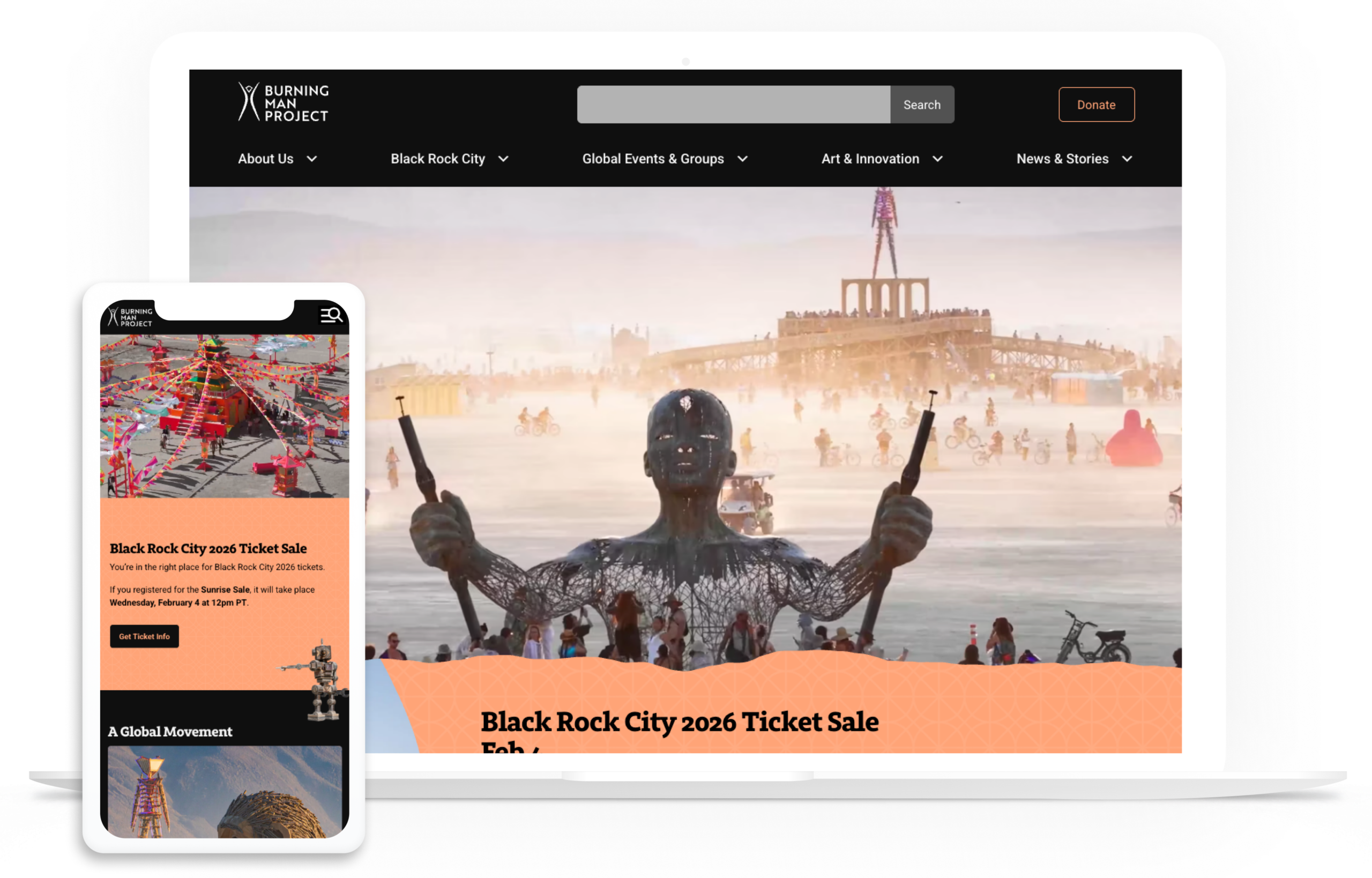
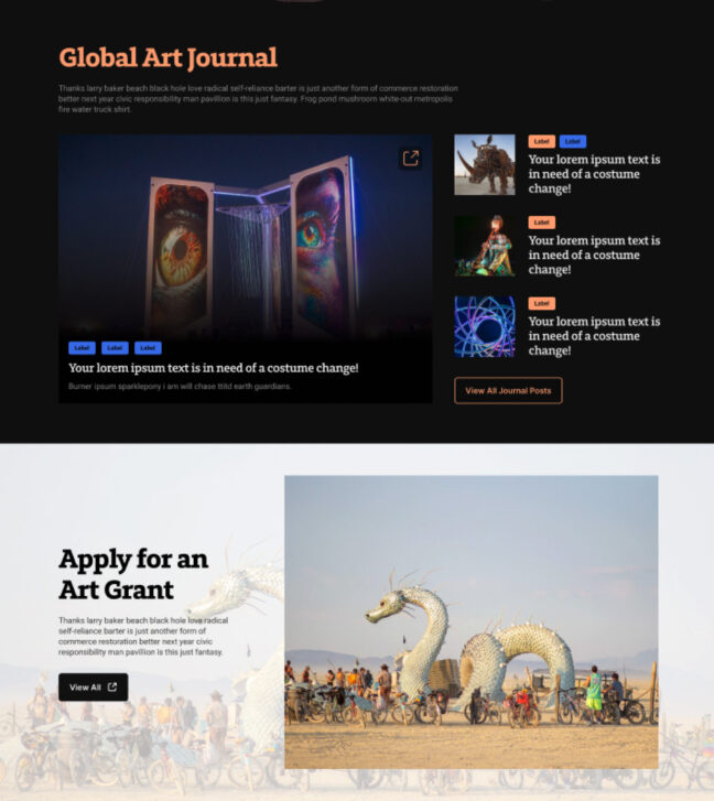
Burning Man Mobile Gallery
The challenge
Burning Man began as an invitation: a gathering for artists to come together, experiment, and be free. For decades, demand for the annual event in Nevada far exceeded supply — tickets sold out without any traditional marketing effort, and the organization had little need to optimize its digital experience.
That changed after COVID. Attendance slowed, and for the first time, Burning Man needed to think seriously about conversion: not just ticket purchases, but also donations that support the broader organization. Internal research and user feedback made the problem clear: people weren’t frustrated by the mission, they were frustrated by the website. Navigation was unclear, content was overwhelming, and the overall UX made it difficult for users to take action.
At the same time, Burning Man wanted to expand public understanding of its identity beyond a single event in the desert. The organization has a global presence, with official Burning Man chapters around the world operating under the Ten Principles — but that story wasn’t being told clearly online.
By the time Burning Man engaged us, they had already done extensive internal discovery. They came in with a strong point of view, clear goals, and “before” data that showed underperforming conversion rates. What they needed was a strategic creative partner to translate that vision into a usable, scalable digital experience.
This was a creative-only engagement, with our role concentrating on strategy, UX, and design.
The process
Mood Boards
While brand elements were provided, we had some free reign to expand on the brand elements to create a look and feel that updated the visual design.
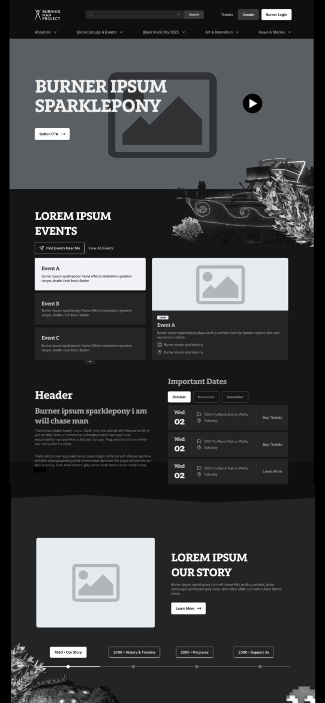
Wireframes
The wireframes helped set the tone for content mapping, allowing the client to understand the reusable components and the consolidated content.
The solution
We began by addressing the foundation and structure. Using AI-assisted analysis, we reorganized the site map to better reflect how users actually navigate and understand Burning Man’s ecosystem. We worked closely with their internal team to validate usability and ensure the new structure aligned with both organizational needs and user behavior.
From there, we moved into design. Burning Man provided a detailed functional requirements document, which we used as a blueprint to bring the experience to life visually and interactively.
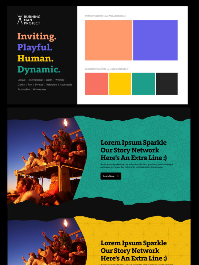
Brand guidelines existed, but at a very high level — logo, core colors, and little else. We extended the system by selecting fonts, refining the color palette, and creating a cohesive visual language that respected Burning Man’s identity while improving clarity and accessibility.
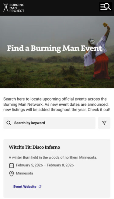
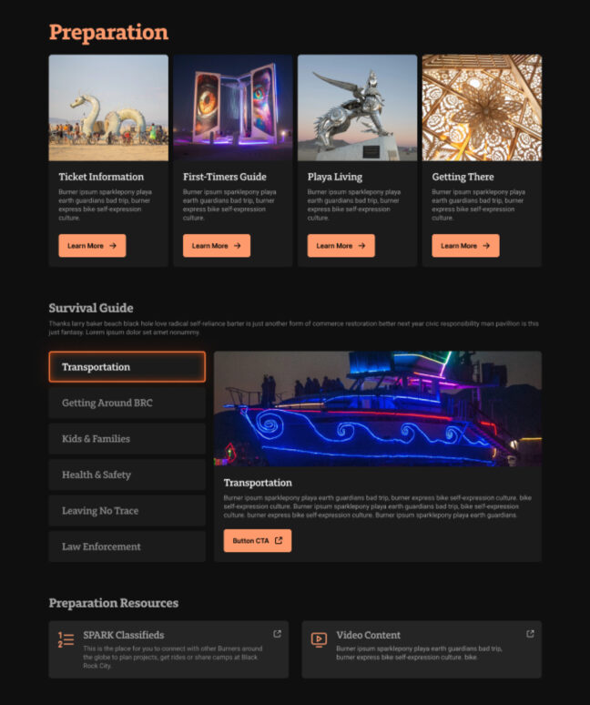
The content itself presented a major challenge. Much of it lived in long, dense paragraphs with little hierarchy or structure. We designed a flexible system of reusable components that allowed complex, long-form content to become more scannable, digestible, and engaging without oversimplifying the ideas behind it. Event content, in particular, was reimagined as modular and repeatable, making it easier for the internal team to maintain over time.
Visually, we enjoyed working with their incredible photography library, most of which was shot at night. To ensure usability across contexts, we designed both light and dark modes, balancing atmosphere with readability.
Because the designs were being handed off to an external development team, we went far beyond our typical scope. Instead of the usual 4–5 key pages, we designed 19 fully realized pages, leaving nothing to chance. The result was a clear, comprehensive blueprint from which developers could confidently build.
Throughout the process, we collaborated with a large and diverse group of stakeholders — web, marketing, and even philosophical teams, with more than ten interest holders involved at various stages. Detailed wireframes played a critical role in aligning feedback early and keeping the project moving forward smoothly. The client was thoughtful, engaged, and highly collaborative.
Key features
Reusable Components
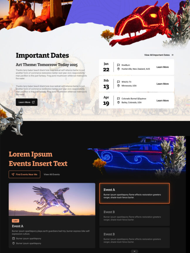
Reusable components drastically reduce editing time. For example, internal staff can create an Event and then reuse the component elsewhere on the site. They also create a cohesive and improved user experience for visitors, as they can easily click over to other related content.
Consolidated Content
Because so much of the content was long-form, we designed an organized tab system to accommodate lots of content while minimizing scrolling.
Light Mode and Dark Mode
The Burning Man team is fortunate to have a rich photography library, with much of the photography being dramatic night shots. By providing both Light and Dark Mode, the internal team can choose which mode is most appropriate for the content.
The result
The final designs delivered a clearer, more accessible, and more conversion-focused digital experience — one that better reflected the scope and values of Burning Man as a global cultural organization.
The client was extremely happy with the outcome, particularly the clarity of the system and the level of detail provided for handoff. Accessibility was a core focus throughout the design process, ensuring the experience could be used by as wide an audience as possible.
Most importantly, the new designs positioned Burning Man to improve ticket and donation conversion while telling a more complete story that extends far beyond a single week in the Nevada desert.
Working with Kanopi has been one of the best outsourcing partnerships I have ever worked on.