



At first glance forms should be relatively simple. You have data that you want to collect, so you put together fields to gather that data and then send the form out to users. The user then fills out those fields and boom, your job is done. However as simple as that seems nothing is ever quite that easy. What if, for instance, the user you send the form to has a vision impairment? What do you need to consider when creating that form? What if the user utilizes a screen reader? These are all questions you should ask yourself when you are creating a form.
Forms can be broken down into two sections; user experience and coding. What does this mean? User experience is looking at the basic structure of the form and the content and making sure that these are understandable for everybody. Coding is looking at the form and making sure that everything is connected in a way that screen readers can understand.
User Experience
For form user experience, focus on clearly defining the field’s intent. An example of this is collecting name data. Some forms might have a ‘Name’ field, however this is ambiguous. ‘Name’ can mean many different things, it can be a first name, it can be a last name or it can be both. For forms, we need to be extremely clear on the data that we want collected by defining this to the user. So instead of saying ‘Name’, clarify what data it is you want each field to capture. ‘First Name’, ‘Last Name’, ‘Middle Initial’, ‘First and Last Name’, are all good examples of clear field labels.
Clarifying the field’s intent leads to a better user experience because you’re collecting the information you actually need in a format you can use. At the same time you want to take a look at all of the data you are collecting and make sure that it is relevant. Are all of these fields necessary? For example, is it useful to ask for marital status? In many cases no, and by including it you are increasing the time the user takes filling out the form. By auditing your content and keeping intentional you create a better experience for everybody.
Speaking of defining the field’s intent, required fields should be explicitly stated for the user. A lot of forms use an asterisk to denote a required field, some forms use red text. However without any language stating what these are, the user can only guess at the function. Be sure to fully state any instruction that comes along with form fields, rather than assuming users know what you mean.
Also never use color alone to define actions, whether in a form or anywhere else. Why is this? 300 million people globally have some degree of color blindness (ref: https://www.colourblindawareness.org/colour-blindness) By using color alone you are limiting the percentage of people who can fully fill out your form without help.
In addition to clearly defining the field’s intent we want to make sure that the form label is always visible. What does this mean, though? There are a variety of ways a form can be displayed. Below are a few examples of common form fields.
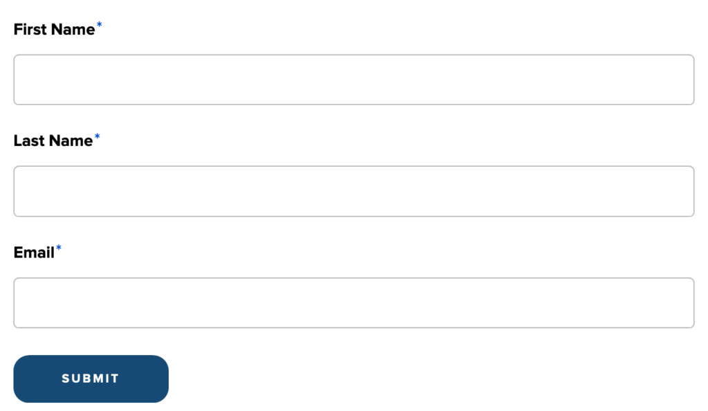
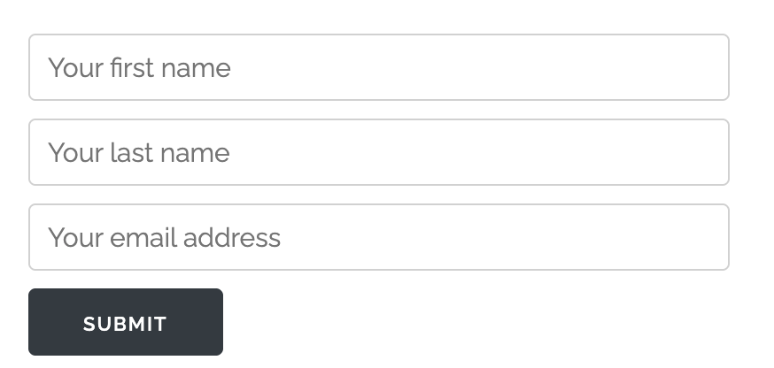
The difference between them is that the second form has the data inside of the field itself. This is problematic because as you start filling out the form this information disappears. For somebody who has cognitive delays, difficulty seeing, or somebody who just got interrupted while filling out the form this can easily cause the user to lose focus and context for what they were entering. This means the user may need to remove what they have entered just to understand the field requirements. It is best to make all form labels visible for the user.
Another thing to consider is mobile development. Many people nowadays use mobile devices as their primary means of browsing the internet. This means that your text should be of a reasonable size–it’s recommended that fonts shouldn’t be smaller than 16px on mobile. Form fields shouldn’t be squished on the screen, for example if you have ‘First Name’ and ‘Last Name’ side by side consider having each field on its own line. Finally, make sure actions like ‘Submit’ or ‘Reset’ are clearly visible and easy to tap.
Coding
The second portion focuses on making sure the code is structured so that screen readers can accurately interpret the form. While this is not directly related to screen reader functionality, it is still an important part of building accessible and secure forms. Form data should never be sent over an unsecured connection (e.g., using HTTP instead of HTTPS), especially when collecting sensitive information such as names, email addresses, dates of birth, or other Personally Identifiable Information (PII).
The first step in confirming that your form is accessible is making sure that you can use the keyboard to access the form by using the tab key and tabbing through and entering data into all of the fields. If you cannot, then the form will not be accessible to screen readers.
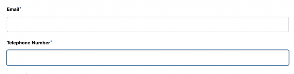
If you have confirmed that you can tab through the fields, you need to make sure that all fields have outlines that indicate where the user is in the form. An example of this can be seen in the picture below where the field in question has a blue outline which indicates it has received focus. For people who have vision loss but are not completely blind, this allows them to identify which form field they are filling out.
Another must-have for screen reader accessibility is making sure that the labels you have created are associated with the fields in a way that they can be read. An example of this is in the code block below.
<div>
    <label for="edit-last-name">
      Last Name
    </label>

    <input type="text" id="edit-last-name" name="last_name" value="" size="60" maxlength="255">
</div>
We can see that we have a label and an input, and there is a for parameter that says that this belongs to the id with the same name. For screen readers this makes an association between the two fields that is relayed to the user.
Finally make sure that your fields are able to capture the data you need. Some people have hyphenated names, and if you have not coded the form correctly, this could be a blocker. The same thing applies for people with really short names, like ‘Yu’ (we discuss this in more detail in this post about inclusive forms). Setting minimum character requirements might seem like a good idea, until it starts excluding users.
So how do you know that you have all of this right? The best way is to have real users test your form and provide feedback. Make sure that users test your forms out on desktop and mobile devices. Make sure that you have a wide variety of users to provide feedback; from people who use assistive technology to people of varying levels of technical experience, to people with different accessibility needs. This helps you catch issues you might otherwise miss. In addition to testing, always provide a way for people to provide feedback. If they can’t fill out the form, they need to know how to reach you.
Be intentional!
Overall, form accessibility comes down to being intentional. The user experience and coding checks above ensure that you are not only thinking through how users interact with your form, but also confirming that it works correctly for assistive technologies. The goal is to create forms that are usable, inclusive, and accessible to everyone.