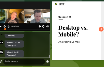
Forms are often the final step between a motivated visitor and a meaningful action. A donation. A volunteer application. A newsletter signup. A contact request. Too often, those journeys end in abandonment.
In this webinar, Cliff Persaud, Director of Strategy and Creative at Kanopi Studios, shares practical ways to design forms that are more inclusive, more accessible, and more likely to convert.
What you’ll learn
Why users abandon forms
- Complexity and unnecessary fields that increase friction
- Confusing layouts (especially multi-column designs) that raise cognitive load
- Accessibility gaps like poor contrast, small text, and weak mobile experiences
- Unclear instructions and error messages that derail completion
What to consider before you build
- How to identify your “most challenging user” and design for them
- How to build accessibility into personas so user needs drive decisions early
- How to decide what’s truly essential from the user’s point of view (not just the organization’s)
- How inclusive language improves comfort, trust, and overall satisfaction
- How to avoid errors caused by “non-standard” inputs (hyphenated names, accents, short names)
How to optimize for accessibility and conversion
- Designing for mobile tap targets and spacing so forms are easy to complete on any device
- Keeping forms focused by asking only for what users perceive as essential
- Avoiding “othering” in form options and building more inclusive choice sets
- Why sliders and ambiguous toggles can create accessibility barriers and confusion
- How to implement real-time, specific error handling that supports completion
- How to test keyboard navigation and tab order to ensure forms work for everyone
- Why clickable labels matter for usability, mobility considerations, and reduced friction
A note on trust and privacy
Visitors often hesitate to share personal data if they’re not sure how it will be used. Cliff explains why it helps to include plain-language guidance near the form itself that answers two questions clearly:
- How will this information be used?
- How will it not be used?
Watch the webinar
Use the video player on this page to watch the full session. If you’d like to talk through how these ideas apply to your site, reach out. We’re always happy to help teams build forms that are easier to use and better aligned with accessibility best practices.


