UCSF Osher Center for Integrative Medicine
Client Overview
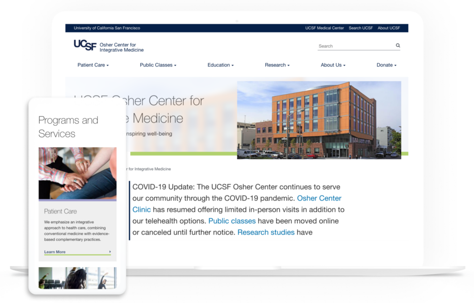
The UCSF Osher Center for Integrative Medicine is a premier integrative health resource for the San Francisco Bay Area and beyond. The first program of its kind to offer fully developed programs in research, education and patient care, the Center strives to successfully integrate modern medicine, healthy lifestyle practices, and established healing approaches from around the globe. This effort meets the need for a new model of care and daily living that promotes healing and well-being of the whole person — mind, body and spirit.
The Challenge
Due to an internal directive at UC to move all sites to Drupal, the Osher Center site was slated for an upgrade. The timing was serendipitous as the site’s content had become outdated and disorganized, to the point where audiences had trouble finding up to date information. Additionally, the site also wasn’t appealing to patients from a visual standpoint, with no warmth and comfort to offer. With a five-month long timeframe, Kanopi was tasked with doing a full end-to-end project involving strategy, design, and development to create a site that worked for a variety of audiences that included patients, fellows, donors, students, and community members.


The Solution
A Better UX Experience Through Structure and Flexibility
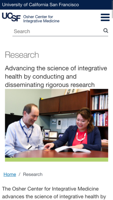
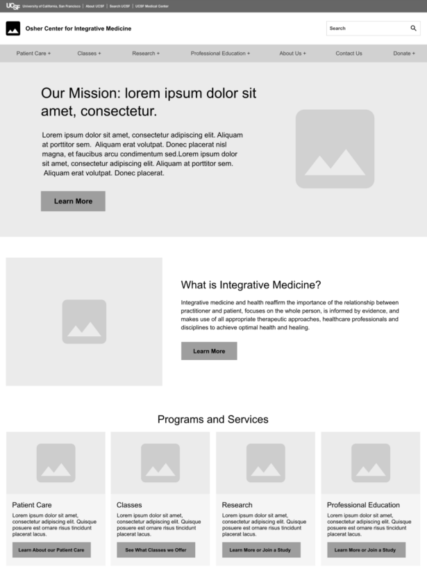
To improve the user experience, a new site map and set of wireframes were created to ensure clear pathways to important information. Using the UCSF Drupal distribution, as well as taking direction from existing UC brand guidelines, Kanopi extended the existing pattern library to meet all the needs for the new Osher Center site. The distribution was also expanded to include flexible layouts so that editors had the ability to confidently populate pages with whatever content was needed to make that layout work.
Visuals that Reflected User Needs
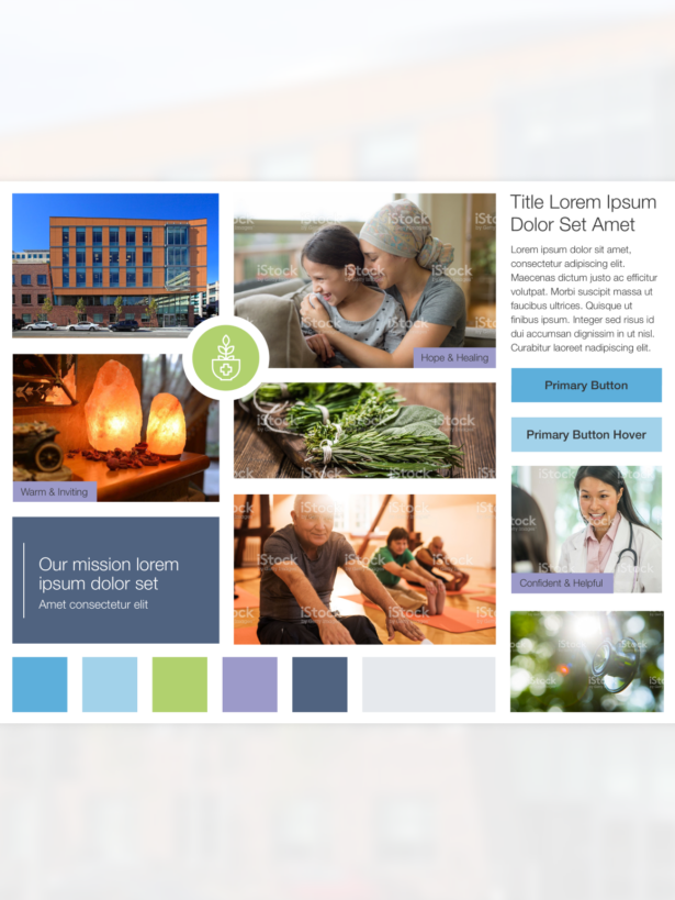
On the visual design front, the goal was to create a site that was warm and inviting, conveying hope, healing, and confidence. The lighter tints from UCSF’s highly saturated primary and secondary color palettes were chosen so the colors were calming and peaceful. Photography recommendations were to use imagery with warm colors and natural elements to insure that the site wouldn’t feel too clinical. Any images with people were to be calming, with positive interactions with patients, practitioners, and class participants.
Content Support for a Streamlined Migration
Migrating content to a new platform can be a lengthy and sometimes complicated process. The Osher team decided to involve the Kanopi team in the process of loading content to the new site. Kanopi assisted the Osher team in loading almost 150 individual pieces of content, saving valuable time and energy.
Key Features
Improved UX Experience
A new site map and set of wireframes were created to ensure clear pathways to important information.
Inviting and Calming Visuals
All images and colors were chosen to create a site that was warm and inviting, conveying hope, healing, and confidence.
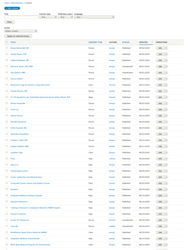
Streamlined Migration
Kanopi assisted the Osher team in loading almost 150 individual pieces of content, saving valuable time and energy.
The Result
A Flexible System Both Visually and Structurally
UCSF Osher now has a set of templates that they can combine in endless ways, regardless of the type of content. The site is also now responsive, allowing for wider audience use. The new site gives UCSF Osher Center a superior tool to help patients and others get the information they need for comprehensive good health.


