The Berkeley School of Information

Client Overview
The School of Information (part of The University of California, Berkeley) creates knowledge and advances practice wherever people interact with information and technology. Their professional master’s degrees prepare students to design and build the systems that will shape the way humans live and interact in the future.
The Challenge
The Berkeley School of Information (I School) contacted Kanopi Studios with a robust request: a redesign of their website, guidance on the modernization of development techniques, and a full migration of their site to the newest version of Drupal — which meant moving over 10 years of content.
The Process
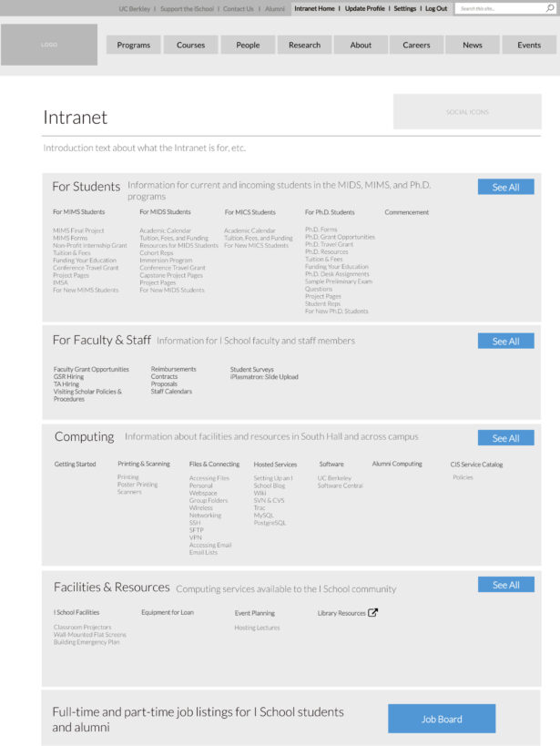
Wireframe of intranet

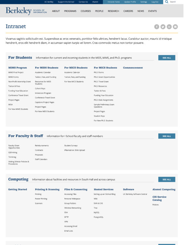
Final Design of intranet

The Solution
The answer to meeting the complex needs of higher education clients is always the same: start with research. With I School, our first stop was discovery. We had to figure out what we had to work with. That meant working closely with I School to determine content types, decide what information was still relevant, map the content to the new site, and gain clarity on the specific content that needed to be migrated during the development phase.
We reorganized the way code and files were structured and refactored some of the custom modules so we could take advantage of newer tools in Drupal 7, such as the Database API, Panels, and various caching methods.
We also provided I School with a full platform for continuous software delivery, with automated deployments to the development site and scripted deployments across all environments. The bottom line? Less downtime and a more responsive site.
From there, we made major menu navigation updates to create a better UX and help accomplish their goals. These include the creation of a Mega Menu with primary, secondary and tertiary levels of navigation; the main menu sections were reordered to account for more popular site sections reading from left to right, based on analytics.
Key Features
Website Redesign
We blended the classic elements of UC Berkeley with a modern look and feel that would attract prospective students.
Mega Menu
Allows users to see and click three levels deep into navigation from the menu, creating better user pathways.
Intranet Homepage Navigation
When students log in to the intranet, they now have three levels of navigation to better identify resources.
The Result
In the weeks following the site launch, measurable improvements were already being noticed, including: sessions increasing by 4.29%, users increasing by 3.11%, and pages/sessions increasing by 17.26%
As the I School is a client that enjoys data, Kanopi was thrilled to help the school solve its problems with data.

It was a great pleasure to work with Kanopi on our website redesign project. We faced a daunting challenge migrating our highly customized site from one version of Drupal to another, while simultaneously moving to a completely new responsive visual design. The Kanopi team’s expertise and enthusiasm were critical to the success of our project. We couldn’t have done it without them!


