Golden Gate National Parks Conservancy
Client Overview
The Golden Gate National Parks Conservancy has a mission of “Parks For All Forever.” Their nonprofit, membership organization enhances access, recreation and educational programs in Golden Gate National Parks, including Muir Woods, Crissy Field, and Alcatraz.
The Institute of Golden Gate is a program within the Golden Gate National Parks Conservancy which incubates knowledge and innovation in parks — locally, regionally, and nationally.
Services Provided
The Challenge
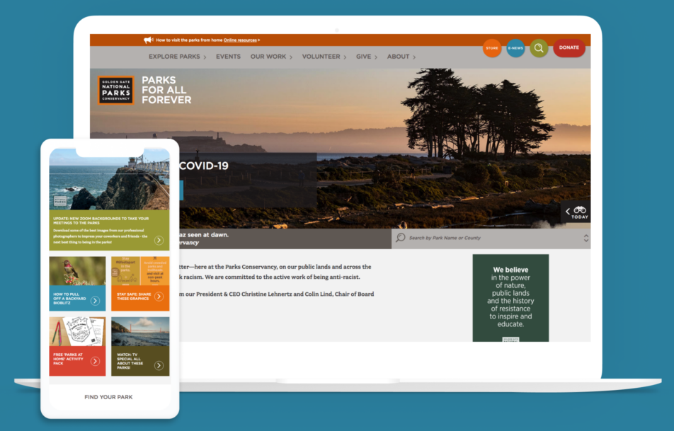
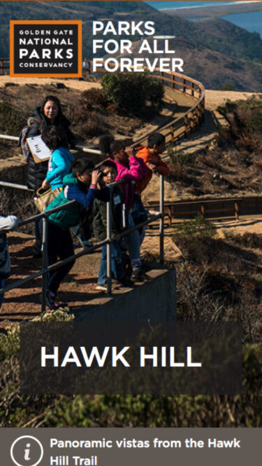
Coming from a Luminate Online environment, the Conservancy had built a complex infrastructure to serve their functionality and multi-departmental website needs and stories. The current structure was difficult to update, and caused challenges for their internal team. Another large pain point was the site’s very outdated design. The parks that the Conservancy serves are visually stunning and naturally captivating — and that same color and beauty needed to be reflected in the visual language and design of the site.
The Process
Information Architecture
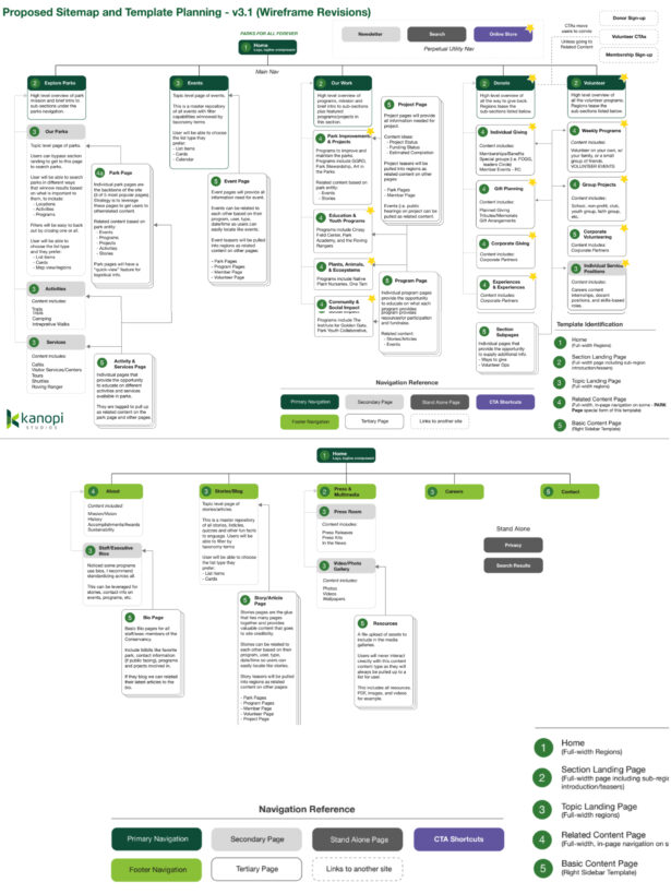
During the user experience strategy phase, we streamlined navigation and organized content to support Parks Conservancy’s wealth of events, programs, initiatives, and articles.
Visual Design
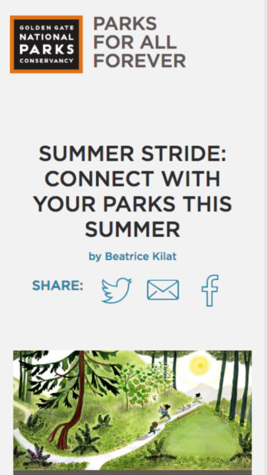
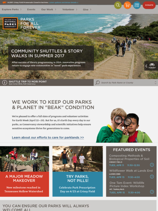
Design elements created a strong sense of place, making use of rich, localized imagery intended to inspire residents and visitors to get out and enjoy the parks.
The Solution
Excited to take on such a pivotal website project for the Bay area, we started by determining a strategic approach to working with the various Conservancy departments. Each department had very specific needs for the website. By conducting stakeholder sessions and capturing the needs of all parties, our teams collectively took the approach of determining a balanced level of uniformity for the first phase of the site launch.
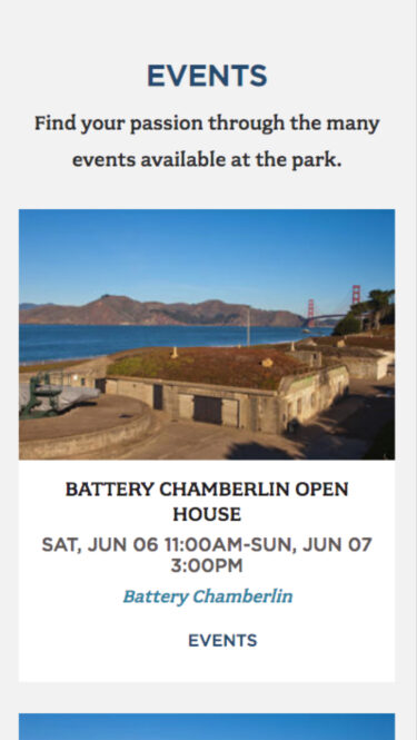
One of the most important insights we gained from extensive user research was that the Conservancy needed an easy way to showcase what was happening at parks each day. To fulfill that need, we created a tab on the browser bar that dynamically highlights key information such as weather, events, and more.
During the course of our full redesign, a program of the Conservancy — the Institute at Golden Gate — also needed a website refresh. We were already in the development phase for the Conservancy, and were able to leverage the work we were doing to find a solution for the Institute simultaneously. The solution for the Institute was to build out the visual pattern library in Drupal 8 as an initial use of the visual rollout. Then the theme and components were reused and leveraged for an efficient completion of the larger Conservancy site build.
As we grow both sites in our Continuous Website Improvement program, we continue to add features and new components to their site experiences.
Key Features
Organized Menu
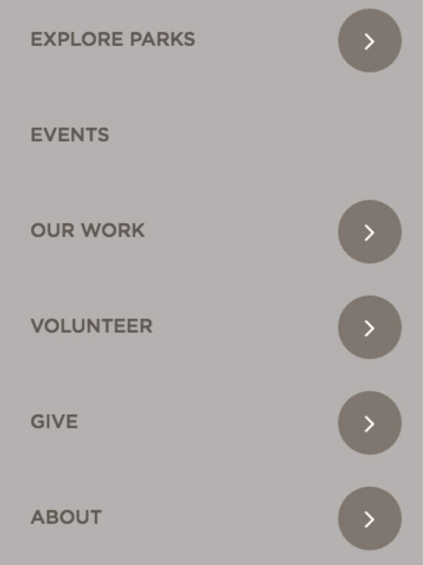
By employing a mega menu approach, we were able to provide users not only clear pathways, but explanatory text to help better understand the diverse groupings of the conservancy.
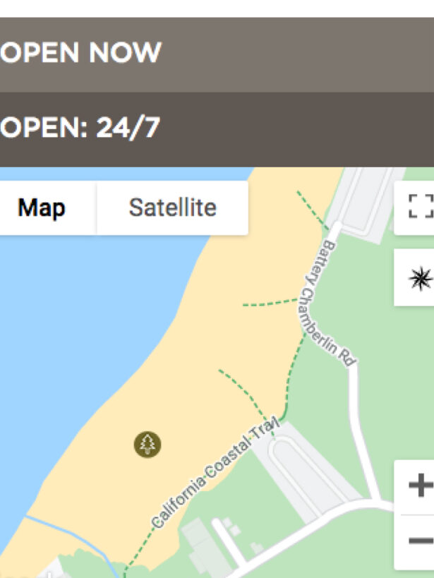
Map Feature
Mapping was a complex feature and a necessary one for the organization. We created a content administration experience which allowed for polygon drawing and mapping files to dictate intricate paths for hiking.
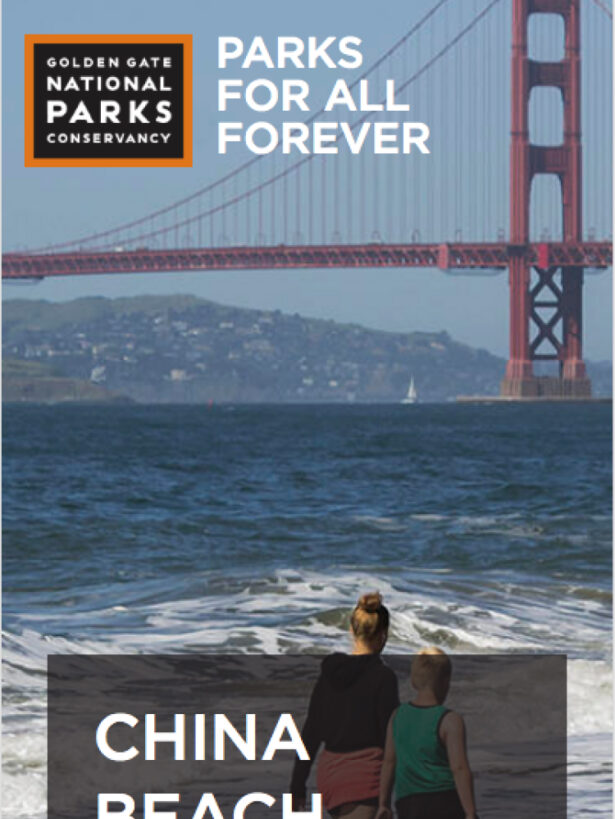
Localized images
The gorgeous imagery showcases the beauty of the parks. There was a focus on displaying this imagery to capture the emotional connection park visitors have with nature.
The Result

The Golden Gate National Parks Conservancy has very much appreciated your professionalism, expertise and strong communications skills in researching and building our upcoming website. Their work in website discovery and UI designs has been great, and their strong project management made everything go smoothly. We are very happy we chose Kanopi for our big website overhaul.


