Certent
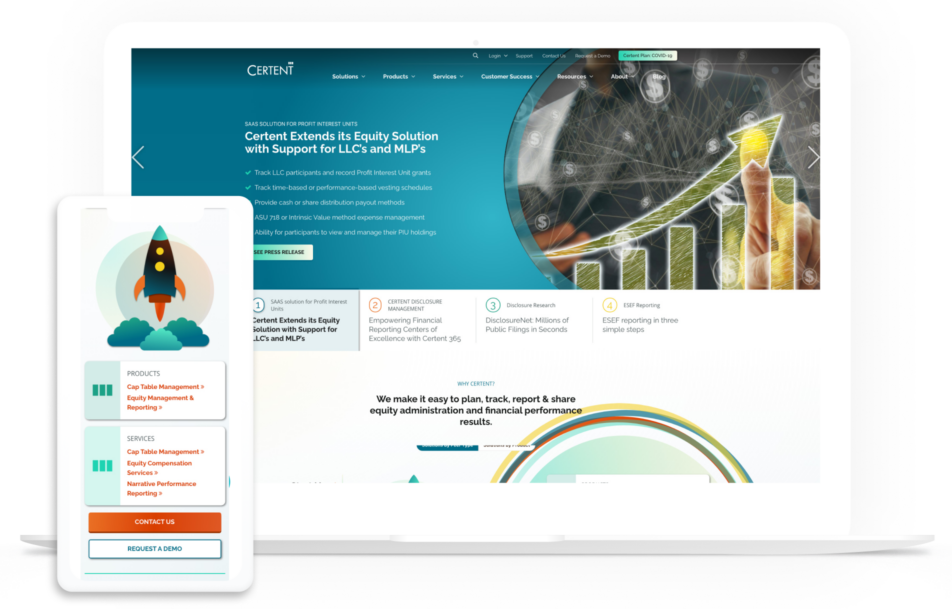
Client overview
Certent, Inc. is a leading provider of software and services for equity compensation and financial disclosure management and reporting. Founded in 2002, Certent serves more than 2,400 public, private, and pre-IPO companies with innovative stock plan management, regulatory compliance and reporting technology. With five global offices, Certent delivers confidence across mission-critical finance and HR processes.
The Challenge
This data-driven company had an existing WordPress website with coding issues that needed major updates. Their UX, design, and technical site problems were resulting in missed business opportunities and lost leads, plus their overall brand positioning was falling short. Because Certent has a sophisticated tech-savvy audience, their marketing team knew they needed high impact front-end website changes to increase their lead quality, and they needed these updates to happen quickly.

The Process
Wireframes
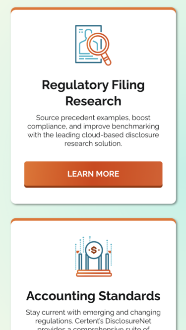
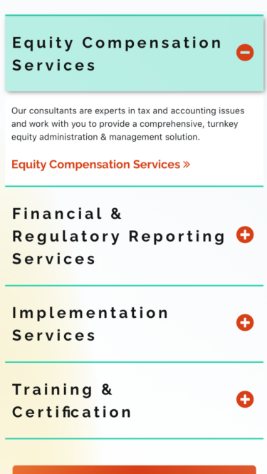
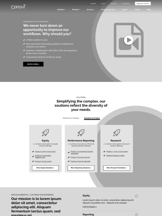
Our approach to the homepage experience was multi-faceted. The desire to provide a better user experience and articulate solutions by type was a big driver for the UX. In this ideation, prospects can more easily self-serve to find a solution that is relevant to them and their identified problems.
Design
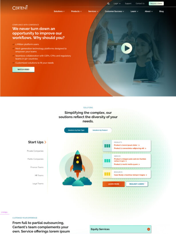
Once the layout and flow of the components were achieved, a visual transformation was the next step. The design was a far departure from where Certent was and the introduction of new colors and visual sign-posts really rounded out a fresh, modern and approachable design system.
The Solution
This large-scale WordPress site update warranted a full website rebuild, but Kanopi was able to work within Certent’s tight time constraints, to accomplish their goals using the existing code. We took a strategic approach to the entire user experience — enhancing and changing content, design, and site navigation.
Starting with the Homepage, we added key elements to create a better and more dynamic UX and ultimately drive lead conversion.
Updates included:
- Adding a Homepage carousel with hero images
- A Homepage video for first-time users to the site
- Updated Main navigation for a better user journey
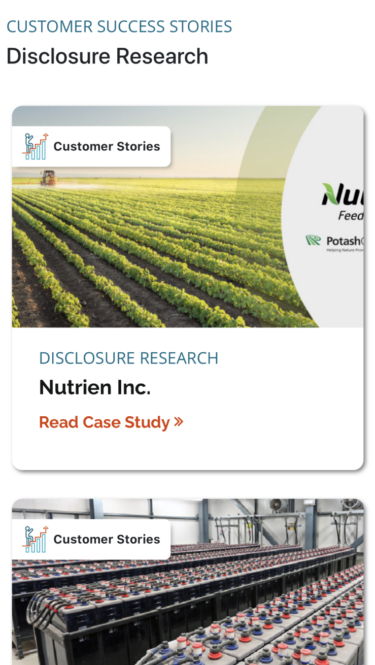
As part of our strategic approach, content, and articles were audited and reorganized to allow site visitors to self-identify based on topics. This enhanced experience support’s Certent’s goals by educating users, and moving them down the marketing funnel.
The Result
Certent’s entire user experience, including content and visuals, was updated to match its innovative product and align with the company’s goals. Kanopi was able to accomplish the revamp without needing to abandon the existing site code — all within a tight time constraint for such a large website project. The redesign creates clear user pathways and a front-end that’s both visually captivating and UX-focused, encouraging high-quality leads and a great customer experience.


