
When CSS was first introduced, it was straightforward. There weren’t any CSS variables, there were no preprocessors. The world was simple, and we were so young! Developers added colors to a site with a hex code (or rgba if they were very lucky and cutting edge!), and those colors were what they were. If a developer wanted to implement a dark and light mode — they often needed to create two completely separate stylesheets and swap the site’s body classes out with JavaScript. Implementing multiple themes on a single site was cumbersome, hefty, and required a lot of additional maintenance.
With the introduction of CSS variables and other color and theme-related CSS features, custom CSS theming has become much easier. When we talk about CSS theming, we’re talking about changing a site based on a user-provided context that lets us still fully control the experience. There is still some element of JavaScript required to swap out the body classes when using a toggle to allow the user to use their preferred theme on your site, but no longer do you have to maintain two separate stylesheets. Native CSS variables make theme swapping much easier than it once was. CSS theming is an excellent way to allow users and developers to dictate website settings easily.
Ways to Use CSS Theming
Dark/Light Mode
Dark and light modes are one awesome, commonplace way to use CSS theming. Users can set their preferred dark or light mode via system settings, browser settings, or even special applications to modify user settings. You can make your entire website respect the user’s settings — which is always nice!
Branding
Say you’re working on a website that features a few similar products, like breakfast cereals. Each product uses the same overarching information for its brand — just with different colors and fonts. Without rewriting huge swathes of CSS for each different product, you can use CSS theming and perhaps a body class in your HTML to provide totally different branded looks for your products.
Accessibility
A combination of prefers-contrast or forced-colors media queries with CSS theming can help make your website more accessible. You can make your site look even better and more accessible to users with these preferences.
Common Considerations Introduced by CSS Theming
CSS theming is a valuable tool to have in your developer toolkit, but it does add some complexities you’ll need to consider during implementation.
Respecting User Settings
As mentioned elsewhere, it’s important to respect user settings where possible. It burns the eyes a bit when you’ve got everything set to shades of black (charcoal, onyx, obsidian, jet), and you suddenly land on a page in blinding, brilliant white — or vice versa.
Images
Images are important when theming. Whether it’s an icon where the font color is adjustable, an SVG where the fill color is adjustable, or a regular old JPG, PNG, or WEBP image — you will have to adjust all of the images on your website. A common example is a client logo reel — you’ll have to store two copies (a dark mode compatible and a light mode compatible) in most instances. If you’re lucky enough to have a client logo reel consisting entirely of SVGs, you’ll be able to use CSS to swap the fill. Most of us aren’t so blessed, however. On a site with tons of images — duplication of image files can even become a storage concern if the images are poorly optimized.
Increased QA Time
When you implement CSS theming, the time required to perform quality assurance checks on the work increases. The same pages must be checked multiple times when using dark and light modes. Instructions for swapping dark and light mode must be written so that less-technical QA agents understand the necessary steps and how to perform them. It’s important to bake these increases into the budget and turnaround time when working with CSS theming.
FART
Haha, right? Not so much. The “Flash of inAccurate coloR Theme,” or FART for short, occurs when you have improperly digested your CSS selectors a momentary flash of the incorrect color scheme. For example, say your user prefers to use a dark theme — but your website defaults to a light theme before detecting and swapping to the user-specified preference. FART can be handled in several different ways and is an important consideration when theming. Properly-handled rendering makes your site look that much more polished and awesome.
Tools to Help You Theme
CSS Variables (+ JavaScript)
CSS variables are key to effectively theming with CSS. CSS variables enable you to swap out various CSS properties throughout your custom theme. Variables have been widely supported in modern browsers since approximately 2017, so 2023 is a great (and safe) time to start using them.
Variables enable flexibility in your theme and stylesheet. They function similarly to preprocessor-based variables, with a slightly different syntax and a key difference: CSS variables can be updated live. Preprocessors compile your variables, so once you’ve set a variable — that’s that; it can’t be updated or changed within the stylesheet. Native CSS variables can be scoped to different CSS classes, and function more like CSS properties.
Some examples of CSS variable syntax:
Declare a variable:
--brand-color: #c4d600Use a variable:
font-color: var(--brand-color)It is also possible to scope a variable:
.brand-light {
    --brand-color: #c4d600;
}

.brand-dark {
    --brand-color: #153e35;
}
With a little extra JavaScript toggle magic, the brand-light and brand-dark colors can be added to any part of the page. For a global theme, those brand classes can be added to the html tag or the CSS :root selector. For more specific parts of the page, those classes can be added to individual parts and components.
Media Features & CSS Properties
prefers-color-scheme is a CSS media feature “used to detect if a user has requested light or dark color themes” (MDN). prefers-contrast is similar, used to “detect whether the user has requested the web content to be presented with a lower or higher contrast.” These color scheme preferences work like any standard @media query used to target browsers by screen size — they’re just working off of color and contrast preferences instead of size.
Color scheme is the user setting engaged either in system settings or occasionally the browser settings. This allows you to make your CSS more specific when the user prefers a light or a dark mode, or a high-contrast theme.
These media features are important for accessibility work, which helps users with low or no sight when browsing your website. When you make your site look even better for these users, you’re going the extra mile in terms of accessibility – always a worthwhile endeavor!
When drilling down to specific elements, the color-scheme property can assist. This property allows an element to indicate which color schemes it can be rendered in. This property is especially useful when styling default form controls; custom form controls such as select or radio buttons can be a bit of a tangle under normal circumstances. The color-scheme property and default form elements make that process slightly less painful.
Theming Specific Libraries, Tools, and Practices
- https://toggles.dev/ provides some amazing premade animated toggles for light and dark modes. Lightbulbs, suns and moons, and other cute icons galore!
- Various front-end libraries have implemented theming-specific tools. It’s always a good idea to check out what the big players are implementing. Bootstrap and Tailwind both have some great ideas and inspiration for CSS theming, with the benefit of widespread usage. It’s great when someone else runs into your problem before you do!
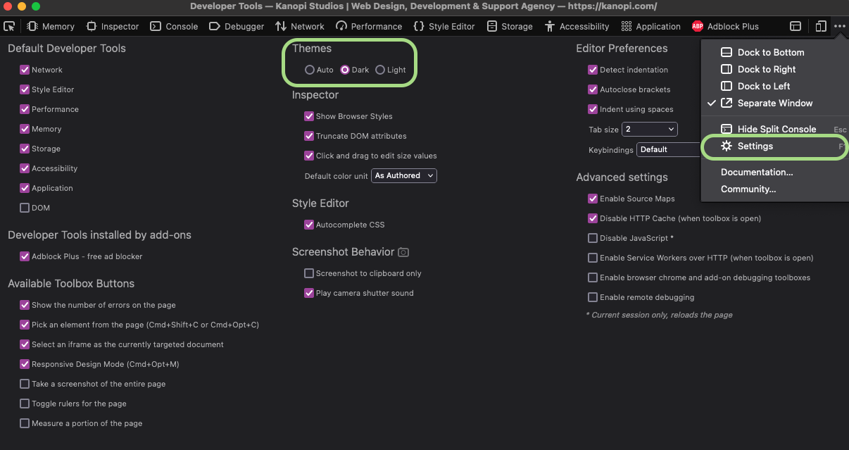
- For testing and QA purposes, you can swap between dark and light modes in various ways. Your computer’s global system settings will allow easy swapping between dark and light modes. However, if you don’t want to go that far — the developer tools in various browsers often also allow you to switch between light and dark modes. Here’s a screenshot showing how to do this in Firefox.
Summing Up CSS Theming
CSS theming is a new paradigm, with new concerns and considerations. However, there is a lot of power and flexibility that comes along with CSS theming. It’s a worthwhile endeavor to get familiar with CSS theming and the associated new CSS features such as variables, media features, and theming-specific CSS properties. There are plenty of new tools and libraries out there to help you gain fast proficiency with CSS theming.