There’s something wonderful about putting on adult shoes as a kid. They’re enormous and floppy and shuffle around on your feet as you lift and walk. I remember doing this often with my dad’s shoes, regardless of the smell, giggling all the way.
Somewhere along the line between then and now, walking in someone else’s shoes loses that magical charm. It’s more comfortable to maintain the status quo. What works for us must work for everyone, right?
Except it doesn’t. Humans are not “one size fits all” and this is also true when it comes to the internet. Like a building needs accessibility access, a website needs accessible code so that it can be used by everyone.
Many people have vision problems, hearing loss, physical limitations and more. In fact, 27% of adults — a full 61 million people — in the United States alone are permanently disabled in some way. Once you include temporary disabilities (such as a broken wrist), or extend the range to teens and children, that number soars even higher.
Your site could be unusable for up to a quarter of your audience, and it’s worth it to check. Follow this guide to do some quick testing, or jump down to our tl:dr.
Why automated tools are useful but also insufficient
We’re often asked for metrics and automatic scans that can “score” a site for accessibility. As appealing as that may sound, it’s simply not an option in the current technical landscape. In reality, it is generally accepted that automated tools can only detect about 30% of WCAG’s 2.1 success criteria. Any tool or service that claims 100% automation is 100% lying.
The reason for that is there are many accessibility issues that Artificial Intelligence (AI) simply cannot understand, and while a scan could possibly identify a place where a human mind should take a look, it couldn’t say with any certainty whether or not there is an error there. In fact, the more aggressive the scanning tool, the more likely it is that there are false positives in the results.
A common example of this are images. Automated tools can detect whether or not an image has alternative text (a requirement for accessibility) but they can’t tell if the alternative text is appropriate for the image.
Because of this, testing requires both automated tools and manual tests. And since each tool is different in what it can detect, and how it presents its errors, it’s recommended that you use multiple tools when testing website accessibility. Each tool has its own pros and cons, things it does really well, and areas that need improvement.
By the way, the disparity between automated testing and manual testing is also why we highly recommend you avoid quick fix solutions like overlays. There are a number of other reasons, including legal reasons, but when it comes down to it automated tools are only part of the process.
Automated scanning tools to use
Lighthouse (Google)
Pros:
- Provides scores out of 100 (for people who love metrics)
- Gives advice for manual checks
- Easy to use extension
- Generally no false positives
- Identifies target size errors
- Can also provide SEO and Performance audits
- Links errors to Deque’s aXe ruleset
Cons:
- Very simple scan
- Only audits 44 possible accessibility errors
- Provides minimal information regarding errors
WAVE
Pros:
- Easy to use via URL
- Allows toggling styles and javascript on and off for scans
- Attractive visual interface
- Shows Level A and AA items as errors (red)
- Shows Level AAA, and Best Practice items as warnings (orange)
- Identifies all ARIA used
- Identifies all structural elements
- Identifies accessibility features applied
- Identifies contrast errors separately
- Provides helpful information regarding error
- Links errors to WebAIM’s WCAG 2 Checklist
- Links directly to code in Developer Tools
- Has built in contrast checker
Cons:
- Cannot scan javascript injected content
- Generates a few false positives each scan
aXe
Pros:
- Shows Level A and Level AA errors
- Best Practice items can be toggled on and off
- Groups errors by serious, critical, moderate, and mild errors
- Groups uncertain items for manual review
- Links errors to Deque’s aXe ruleset
- Explains specific fix options for each error
- Links directly to code in Developer Tools
- Rarely gives false positives
Cons:
- Extension can be overwhelming and difficult to use
- Does not scan hidden items
- May or may not scan javascript injected content
SiteImprove
Browser extension
Paid Platform
Pros:
- Platform version can scan site wide
- Platform scans for Level A, Level AA, and Level AAA errors
- Includes scans for Best Practices
- Platform provides a score out of 100 (for people who love metrics)
- Extension can be configured to scan for specific levels, such as warnings, items to review, best practice, items likely related to content entry, etc
- Links errors to WCAG 2:1 Guidelines
- Links directly to code in Developer Tools
- Groups errors by guideline
Cons:
- Aggressive scan causes frequent false positives
- Considers many Level AAA and Best Practice items to fall under Levels A and AA
- Difficulty understanding javascript injected content
ANDI
Pros:
- Extremely easy to install
- Very visual interface
- Provides information on how a screen reader might interpret some elements
- Great entry into understanding what kinds of errors can exist
- Has built in contrast checker
Cons:
- Does not link errors to guidelines
- Limited suggestions for fixes
Add manual testing to find what the automated tools didn’t
Once you’ve run your site through some of the automated tools, it’s time to get some hands-on experience about what it’s like to use your site in someone else’s shoes.
How to do keyboard testing
Believe it or not, keyboard testing is actually “low key” and easy to do. There are only a few things that you need to know in order to do this testing on your own.
Tab, Shift + Tab
Pressing tab will move you down a webpage through interactive elements like links, buttons, and form fields. Pressing shift + tab will take you backwards through those same elements.
Spacebar / Enter
These keys “activate” interactive elements. When you are focused on a link, hitting one of these will open that link. Sometimes they can also move you into an “application” state where other keys become usable (see Arrow Keys).
Arrow Keys
These keys will scroll the page up and down, but not always. Tabs, accordions, sliders, and menus can be designed as applications. That means once you are focused on them (or enter them using the spacebar), using the arrow keys will navigate you through those interactive elements instead of scrolling the page.
Esc
If you have entered an application, or a popup window, the escape key should exit that area and allow you to continue down the page where you left off.
Knowing these interactions, you should be able to use your webpage without a mouse. Try it for yourself and see if you can reach and use all of the interactive elements.
- Can you see where your focus is (what your next keypress will activate)?
- Can you navigate through your menu?
- Is tabbing logical, or does the focus move to unexpected areas?
- Can you use sliders, accordions, galleries, videos, and tabs?
- Can you enter form information and submit?
- Do you get “trapped” anywhere and need to use your mouse to move on?
If you can’t use your page without a mouse, or if the keyboard experience is generally frustrating, then there’s some improvement to be made with accessibility. Keyboard functionality is vital to most assistive technologies, and if you had a hard time then chances are so is someone else.
A note about screen reader testing
You will likely need to hire someone to do this for you, as it takes a high level of skill and experience to operate. But using the ANDI tool on your site can show you some of the things a screen reader will present to a user, so if you’re interested give that tool a try.
To learn more about screen readers and assistive technology, check out our Screen Reader 101 blog post.
Where to find real users to test your site
Putting your site in front of real users with a variety of disabilities will most certainly uncover any issues missed by automated and keyboard testing.
Here are some resources for finding those users:
- Recruiting People with Disabilities
- UsableNet
- UC Berkeley Disability Lab
- Fable
- The Center for Accessible Technology
If you think there’s a problem, it’s time for a deep dive audit
While the methods mentioned here can give you an overall picture of a single page’s level of accessibility, it doesn’t reflect the full breadth of your site. For that, you’ll want a deep dive accessibility audit.
This type of work typically takes someone with a good deal of experience in the accessibility space. It would entail automated and manual testing of multiple pages to try and get a sample of each template used, in addition to some randomly selected pages. The auditor needs to know how to use multiple tools, how to test via keyboards and screen readers, how to investigate Javascript injected content, and know what to look for in criteria that can’t be caught in an automated scan.
Kanopi specializes in accessibility for our clients and we do offer deep dive accessibility audits, including itemized results for remediation. If you’re interested, send us a message!
TL:DR for testing your website’s accessibility
Try to use your website without a mouse.
If it’s frustrating for you, it’s frustrating for someone else.
Imagine someone was trying to navigate your homepage only by headings and links.
If someone couldn’t see the page and only had these elements to navigate by, would they know where to go?
Run your most popular page through two or three of the tools mentioned in this article.
A single issue can prevent someone from buying a product, viewing a service, or understanding your content. Take any errors seriously.
Re-test your site every so often.
Updates to code and content can unexpectedly change your site’s accessibility. Regular testing helps keep you informed about potential barriers on your site.
Want more accessibility info via a webinar?
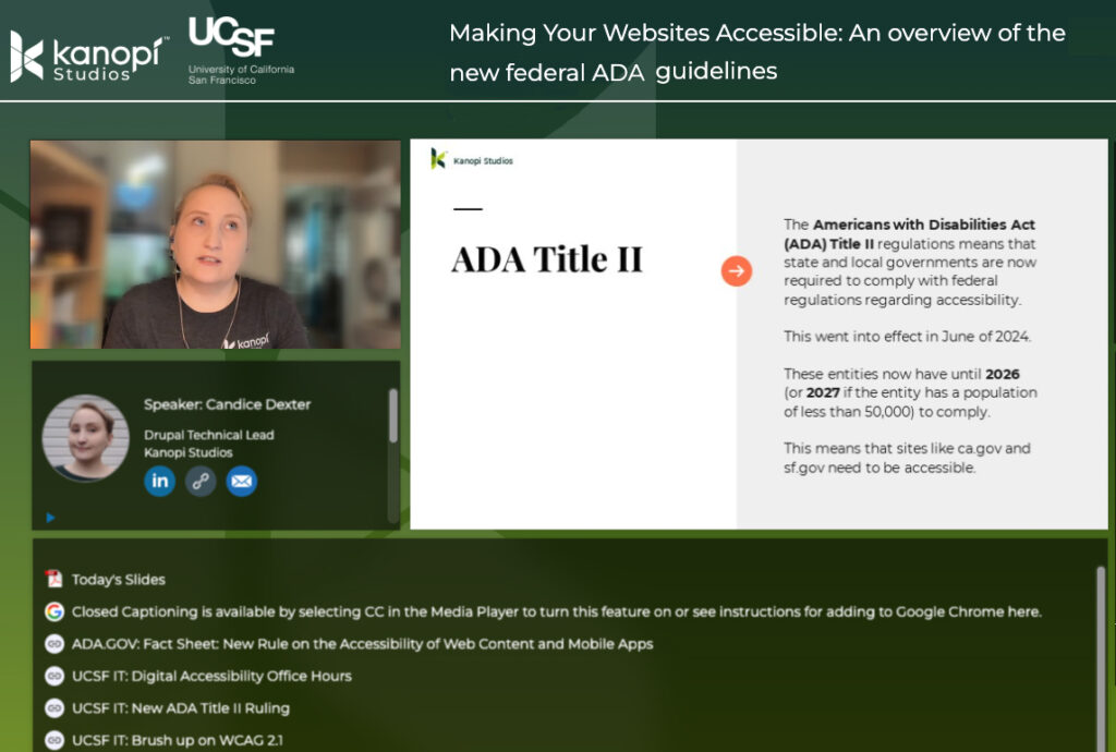
Kanopi’s Candice Dexter gave a webinar for our client the University of California San Francisco called “Making Your Websites Accessible: An Overview of the New Federal ADA Guidelines.” (30 minutes)


